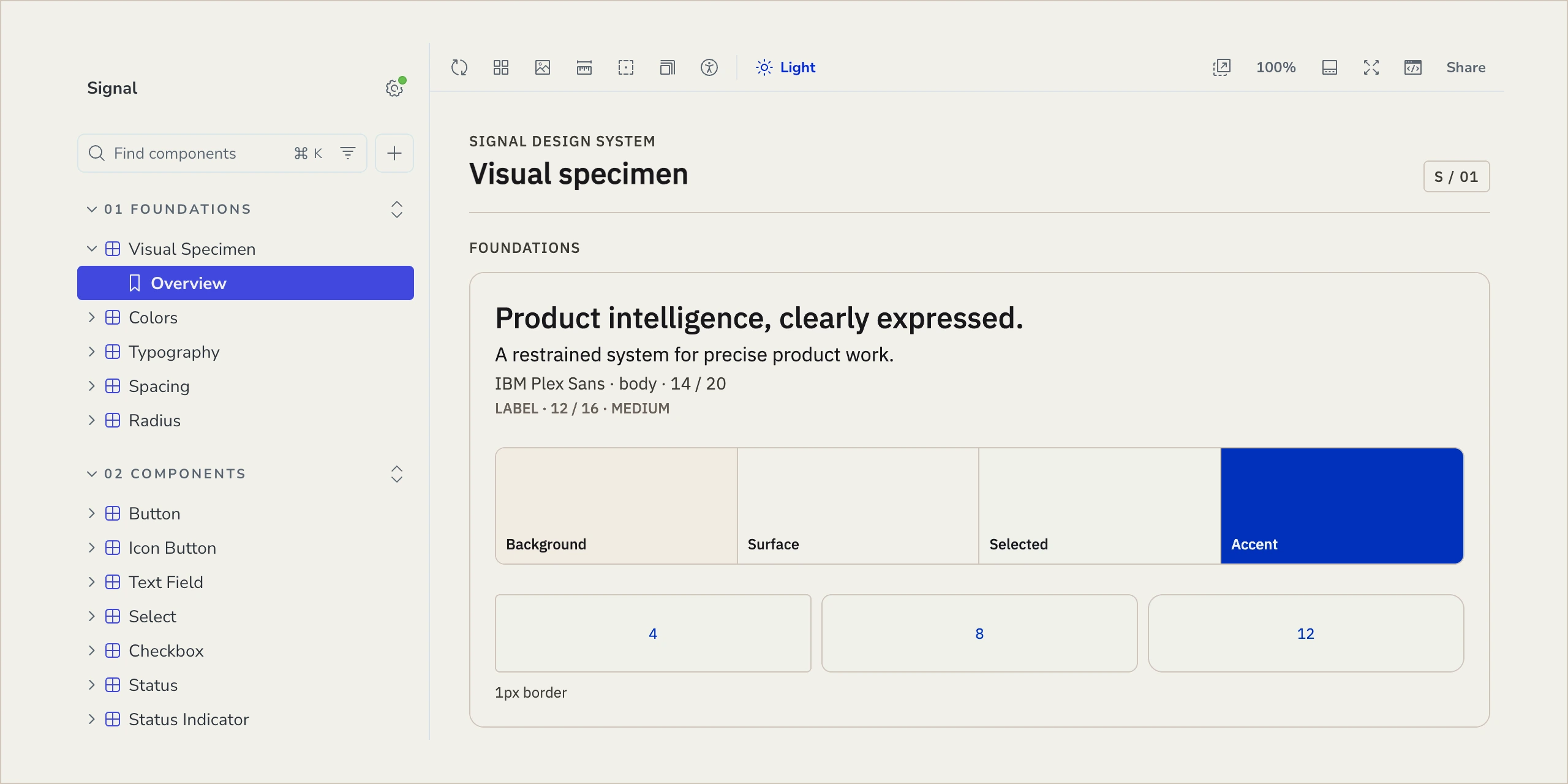
A design system, carried through.
- Product Design
- Design System
- Figma
- Storybook
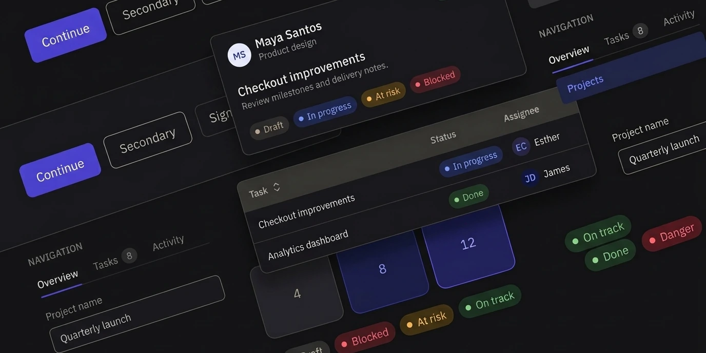
Consistency has to survive the handoff.
A design system can look consistent in Figma and still fall apart in implementation. Signal explores what happens when the same decisions have to survive the whole journey, from foundations and components to reusable patterns, React, testing, and delivery.
01 / Foundations
Consistency starts before the first component is drawn.
Color, typography, spacing, and geometry begin as primitives and become semantic decisions shared across the system. Light and dark themes use the same underlying structure, giving every component a common visual language to build from.

02 / Components
A component is where the rules become behavior.
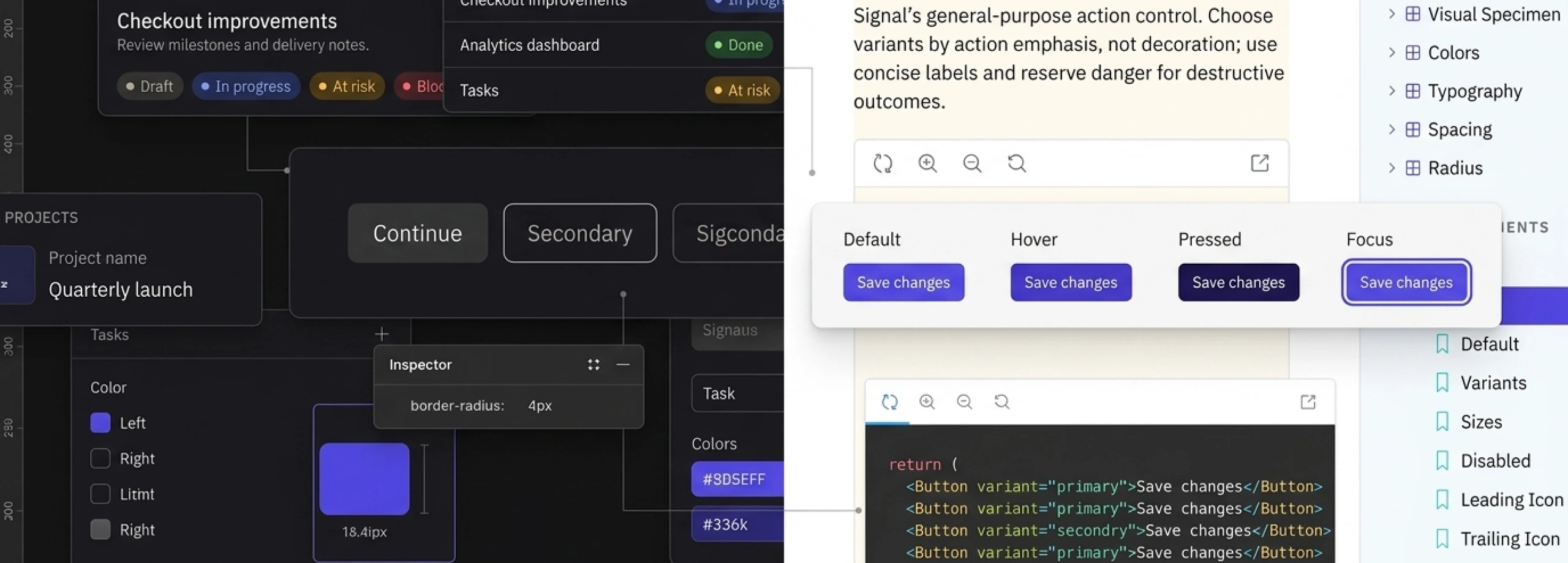
Buttons, fields, selects, tabs, status indicators, and other controls share the same foundations, but each introduces its own states and interactions. Variants, sizing, focus, disabled states, and accessibility are treated as part of the component rather than finishing details.
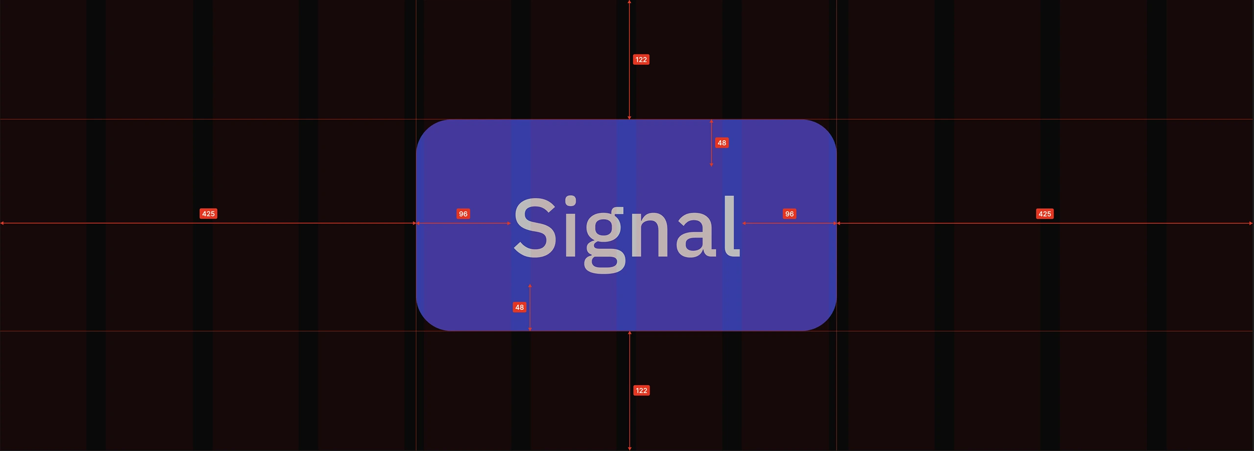
03 / Patterns
Components become useful when they work together.
Navigation, filters, tables, status, and identity bring individual components into larger interface structures. Patterns test whether the rules established in isolation still hold when hierarchy, density, and interaction begin competing for attention.
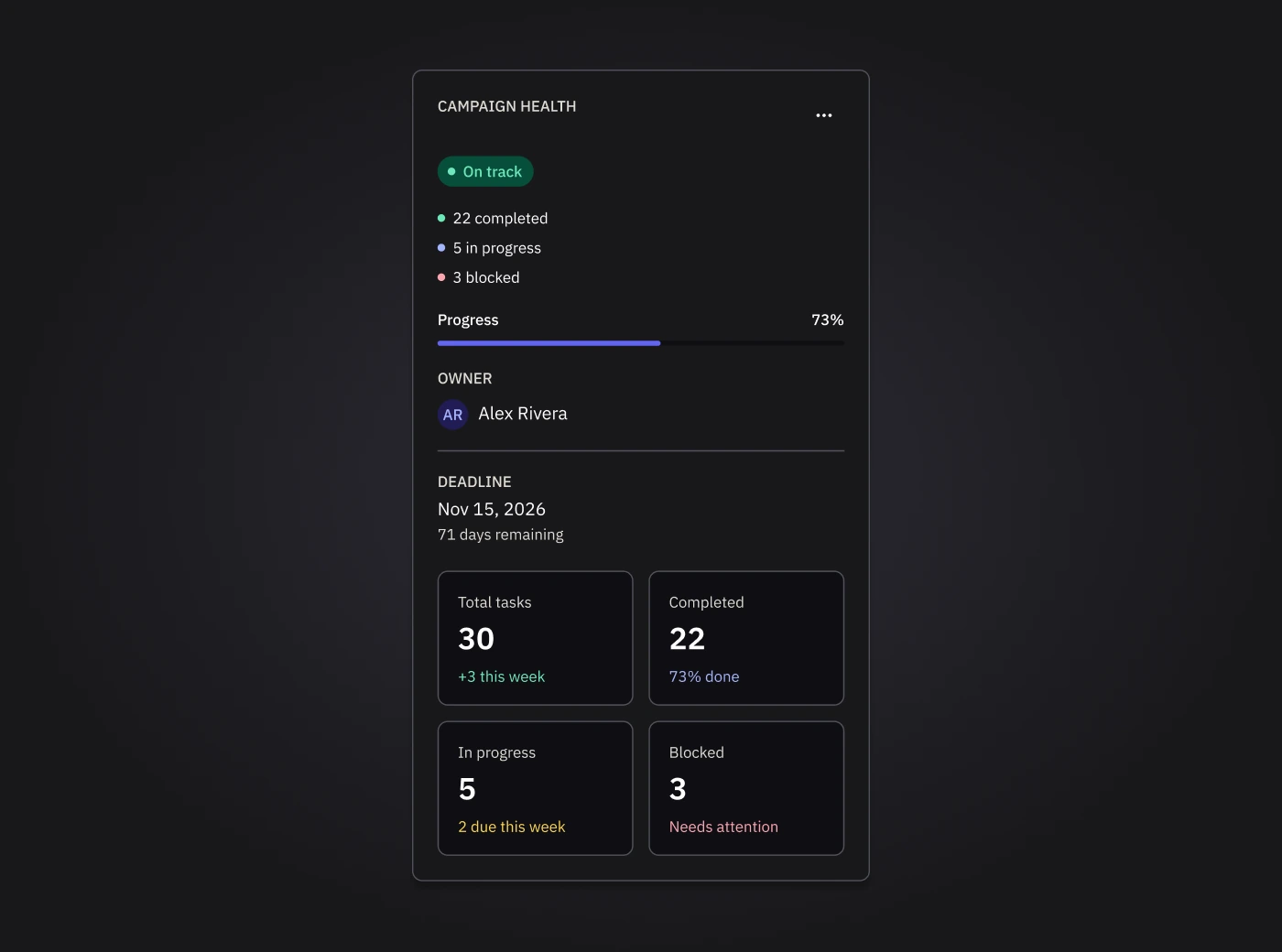
04 / Implementation
The same decisions have to survive in code.
Signal carries tokens, variants, states, and behaviors from Figma into reusable React components. Storybook makes the implementation visible alongside its states and documentation, creating a working reference rather than a separate interpretation of the design.
05 / Validation
The system has to keep working as it changes.
Interaction, keyboard behavior, responsive layouts, and accessibility are tested alongside the components themselves. Automated checks and CI help catch regressions before changes are delivered, while Storybook keeps the working system available for review.